We will be going through a process for creating a “snappy” looking beach scene that may increase the “cool image factor” using Adobe Fireworks software.
Note: Although Adobe Photoshop may be a top choice for some graphic designers and image editors, we will stick with Adobe Fireworks for this example. 🙂
I will be showing you how to design — in a very visually oriented and tedious step-by-step process, a great way to create a beach themed header for your own website. For more details on what a finished beach header file in Fireworks looks like, please see Figure 1.0.
HINT: Click on the “Beach-scene-as-your-possibly-future-website-header” above for full view.
Here is the skinny & low down for this “How To”:
- Header Dimensions — 1440 x 140 pixels
- Format: Dot-PNG or Dot-JPG
- Style: It’s all about the gradients.
- Adobe Fireworks (CS5 is what I am using, but feel free to use a newer version.)
Okay, so you want to wow your friends and family with something that will make them raise eyebrows like that time you came home from art class with that really awesome thingy you made with leftover popsicle sticks and Elmer’s glue as a thoughtful gift for Aunt Barbara.
Yes, we know it is the thought and effort that counts, right? That is why I have all the confidence in the world that anyone who wants the “Ninja banner designing” skills that come with Adobe software can do this! Now, it’s time to get down and gritty with some creativity, in a banner-for-summer style!
Let’s create a brand-speaking new file by OPENING your Adobe Fireworks software.
- Click FILE located in the top left of the toolbar.
- Next, choose NEW that is the first drop down choice located under the FILE section. (See Figure 2.0).
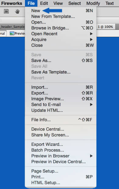
(Figure 2.0. Screenshot of Arrow point to the “New” selection located under the “File” menu.)
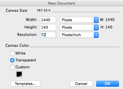
Once a “New Document” pop-up box appears, set the new file up using the following specifications:
- Key in 140 and select “Pixels” from the menu that is to the right of the Height text box.
- Key in 1400 and select “Pixels” from the menu that is to the right of the Width text box after you have clicked on NEW.
- Key in 72 and select “Pixels/Inch” from the menu that is to the right of the Resolution text box. (See Figure 3.0)
Note: Even though there is some debate on when 72 DPI (Dots per Inch) resolution is still relevant for print media, the image we are going to create is for Internet publication only. So, a resolution of 72DPI can work. Some have create resolutions of up to 300 DPI, but for this relatively small banner size, there is no need to do this.
For Canvas Color, I prefer “Transparent” over “White,” so Click the radio button to Select “Transparent.” (See Figure 3.0).
(Figure 3.0. Specific Dimensions for a New Web site Header.)
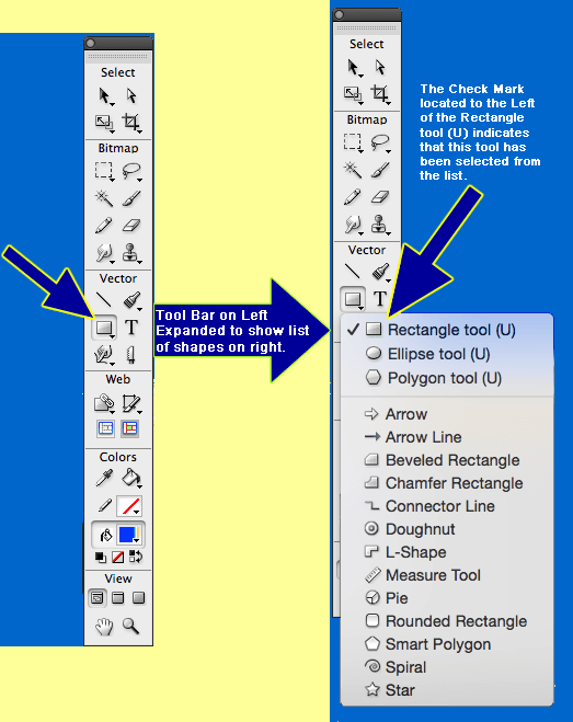
Once a new header file has been created, just click on the “Shape” selection that is located in the “Vector Section” in “Tools” to begin creating our header. (See Figure 4.0).
(Figure 4.0. Vector section with expanded view (choosing rectangle shape) for designing your header.)
Next, take the rectangle tool and click at the top left corner of the blank 1440 x 140 rectangle, dragging the colored box to the right until the whole rectangle is filled.
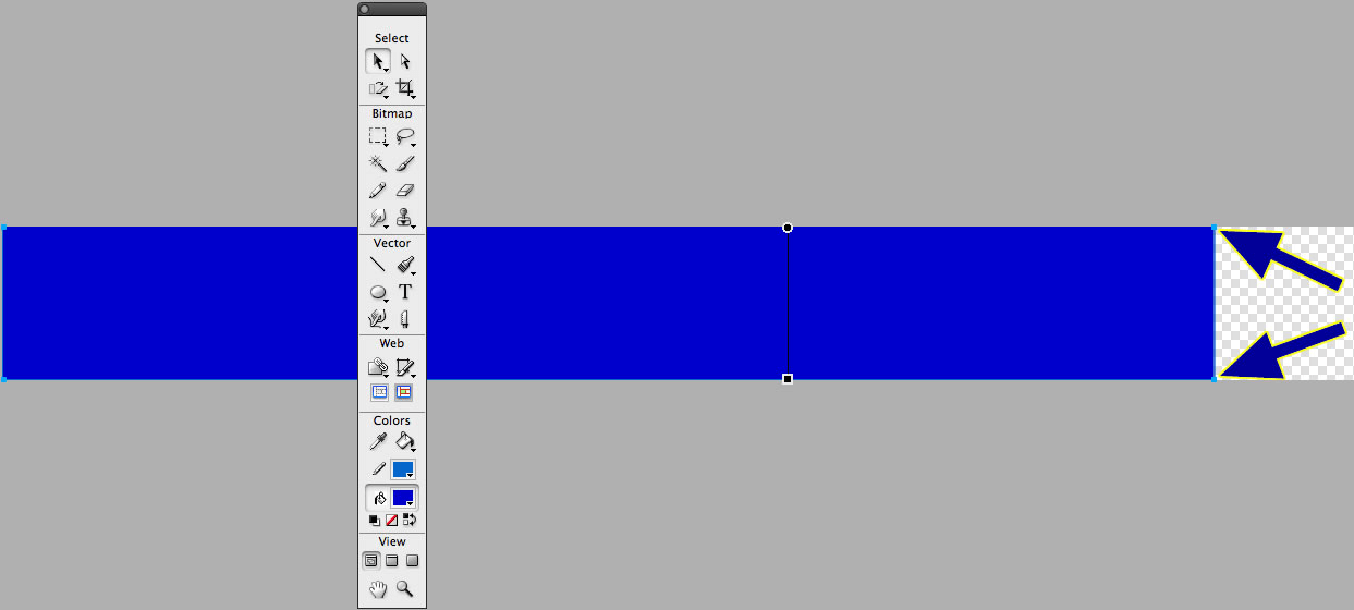
Note: If any trouble should occur with trying to successfully drag the rectangle shape tool all the way to completion like the image posted below (See Figure 5.0), we can fix that in three small steps (See Figure 6.0).
(Figure 5.0. Specific Dimensions for a New Web site Header.)
To make the colored rectangle fit the whole canvas for the header image here are those three steps:
- Go to the top of the toolbar in Fireworks and click “Modify.”
- Look for and select “Canvas.”
- Click “Fit Canvas” after expanding “Canvas.”
Look for the black colored “right arrow” to expand the selections. See my large blue arrow to help with pinpointing the “Fit Canvas” action.
(Figure 5.0. Specific action of “Fit Canvas” when colored rectangle has only partially filled the specific dimensions of header file.)

****A screenshot of a blue rectangle with arrows pointing at end it like it were a completed header.
(Figure 6.0. Finalized fitting of colored rectangle for your new web site header.)
Once the rest of your rectangle fits nicely in the 1440 x 40 dimensions we have set up, we can begin working on the actual beach scene for our banner! Hurrah!
Don’t worry about the color of the box at this point – we’ll adjust that issue in a few steps.
- Click the paint bucket palette tool to select one color.
- Next, click the “Fill Options button.” (See Figure 7.0)
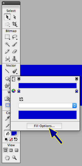
(Figure 7.0. A screenshot of blue arrow pointing at the “Fill Options” button.)
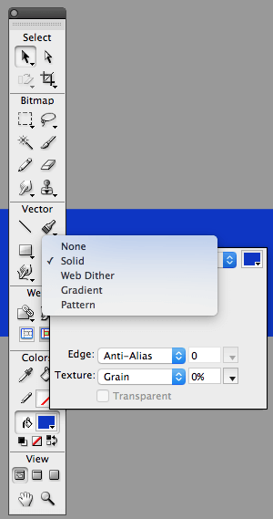
Clicking on the “Fill Options” button allows you to select from a list of different attributes for your header like the following:
- Solid
- Web Dither
- Gradient
- Pattern
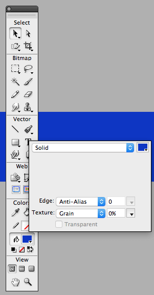
Note: For this design we want to select “Gradient” instead of “Solid” (See Figure 8.0). By default, the Solid selection will appear after clicking on the “Fill Options” button. (See Figure 9.0)
(Figure 8.0. The original Solid selection that appears when clicking on “Fill Options” that we DON’T want. Gradients is our choice!)
As a reminder, here is another screenshot (Figure 9.0) of how things look with our “Fill Options” for this header is expanded to show a list from which to choose an option.
(Figure 9.0. Five different choices for “Fill Options.” The choice of “Solid” being checked on this list.)
Now that we have chosen gradient from the list and ditched our original “Solid” choice (See Figure 8.0), let’s get ready to put those digital paint bucket skills to good use! YEAH!
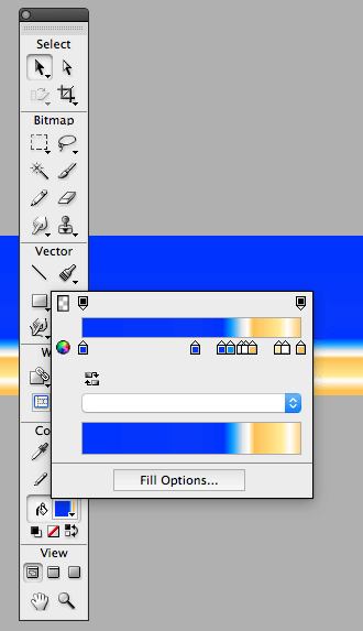
Oh, just a friendly reminder: We will use ten (10) paint buckets to give this banner the look of dimension and general “ visual coolness when the whole tutorial has been completed.” (See Figure 10.0)
(Figure 10.0. Screenshot of what the header design of a Beach look would be like with all ten paint buckets added.)
Note: We will look at how to edit the color that will give us that nice “beachy” look and feel using gradients in the next step.
OK. Let up begin with just the two buckets for our linear gradient. The first bucket that we will edit will be situated all the way to the left.
- Click on the paint bucket and key in the RGB color of #0033FF.
- Next, click on the far right paint button and key in the RGB color of #FEC254
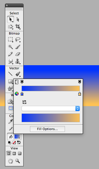
At this point, the gradient line and bucket colors and their exact positions should look something like the image below. (See Figure 10.1).
(Figure 10.1. Blue (#0033FF) and Tan (#FEC254) combination of gradients)
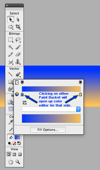
If there is a “snafu” with choosing the right color scheme based on the directions provided with this tutorial, just click on the paint buckets as shown below. (See Figure 10.2)
(Figure 10.2. Click on the paint buckets to edit the color of the header file.)
Our next big step is to place a paint bucket in the center of our gradient that we have. Here is what we need to do:
- Click on the center of the gradient so that a paint bucket appears.
- Next, click on this new paint bucket and key the following RGB code (#0737FB) into the color designation box. For more information, please see Figure 10.3.
SPECIAL TIP & TRICK: To get rid of any of the paint buckets making up the color gradient, click and drag it off screen and it will disappear like magic . . . POOF!
And to Add a New Bucket, just click anywhere on the gradient line below where the color bar appears and one will appear! Clicking and holding on the bucket while moving it with a hand icon allows you to change how the colors mix if there is more than one bucket on the gradient.
(Figure 10.3. Clicking on the color selection box allows users’ to manually change color of bucket and the header.)
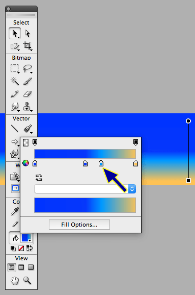
Now that we have the third bucket added and edited with the right color, we are going to add a few buckets that will give us a sense of waves and water lines along the beach. Here are a few steps to add some snappy beach effects:
- Click about a third of the way down from the center bucket and add a fourth bucket.
- Click on this fourth bucket and key in the following RGB color: #0099FF.
Please see Figure 10.4 for exact specifications on where this fourth bucket needs to be positioned to make this beach design look to specification.
(Figure 10.4. Image of the fourth bucket with the RGB color, #0099FF. )
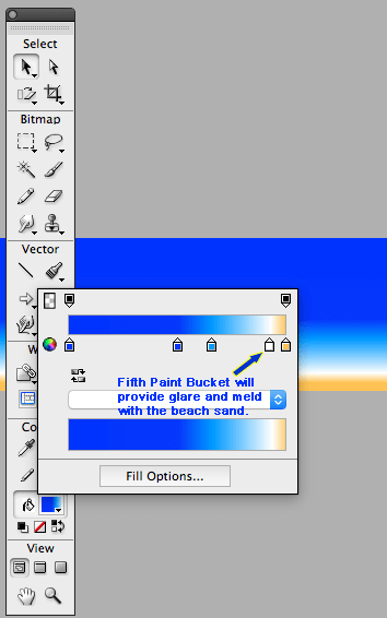
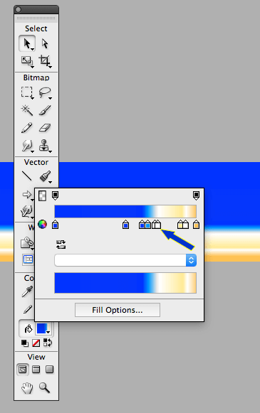
For our next design tweak, we will be adding our next set of buckets to the linear gradient to make our future “beachy” header looks like the sun is providing some glare to the sand. Oh, by the way, our new paint bucket will be white or in RGB standards, #FFFFFF.
Here is the most important point for this part: Our new bucket will also be JUST “ONE bucket distance in length” between our far RIGHT bucket and this NEW (Fifth) one. (See Figure 10.5)
(Figure 10.5. Image of the Fifth bucket with the RGB color, #FFFFFF or white.)
Looks like things are going on nicely, even “swimingly,” if you would pardon my pun! He, he. 🙂
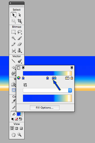
As for our sixth bucket, we will be color coding it with an RGB of #FFEA95. We will be placing this brand new, sixth bucket to the left of our white (#FFFFFF) bucket like the one seen in Figure 10.6. So, please, feel free to. . . (See Figure 10.6).
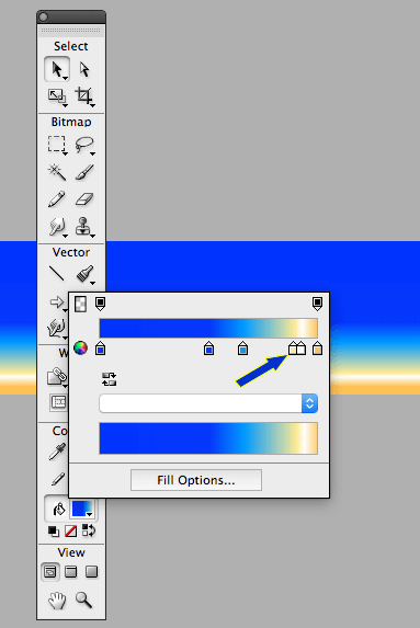
***A screenshot of Blue arrow pointing at our sixth paint bucket located to the left of our fifth, white colored bucket.
(Figure 10.6. Screenshot of arrow pointing at our sixth paint bucket located to the left of our fifth, white colored bucket.)
After the sixth bucket has been created, positioned precisely on the line as well as tweaked with a snappy RGB color of #FFEA95, your beach header is only four buckets away from being completed. Here is what it should look like at this point! (See Figure 10.7).
Note: If you don’t get the sixth bucket nice and tight next to the fifth bucket, just click and drag it as close as you can. There is plenty of “creative license” to tweak your new header just a tad different.
(Figure 10.7. A screenshot of partially finished beach themed header.)
Please feel free to click on the image above to expand this partially finished header to see what the final size will be. Won’t the finished beach scene for our header be refreshing. . . .ahhh, I can hear the waves crashing as we speak. . . I digress.
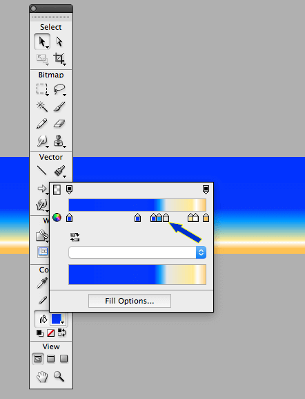
As for our seventh bucket addition, we are going to “berm” up the blue sky and the one visible line of waves with a white crest coming into the beach. Just make sure B-E-A-M is not confused with B-E-R-M or “building up” and things will just fine and dandy. 🙂
We want this seventh bucket to have the color scheme of blue, so make sure to click on this seventh bucket and key in the RGB of #0033FF to make a very snappy blue color appear.
The seventh bucket that we add on the linear gradient line should be nice and snug as well as positioned just to the left of our light blue bucket. Both the seventh bucket and our light blue colored bucket should be side by side with no space between the two. (See Figure 10.8)
(Figure 10.9. Seventh color paint bucket with RGB of #0033FF).
OOOH, AHHH, OOOH, this header is beginning to look real beachy keen! The good thing is that we only have to add three more colored buckets and we are done with this soon-to-be magnificent header.
Let’s move on to our next step, which is to add an eighth colored bucket! Our eighth colored bucket will bring a little “touch of gray” to our tan, white and blue colors already immersed in this scene. I think this color will help give dimension to our scene overall and divide the sky from the waves and the sand. (See Figure 11.0)
(Figure 11.0. A screenshot of blue arrow poined at the eighth bucket with RGB color, #E6E6E6.)
Now that we have added our eighth bucket and edited it so that is the RGB color of #E6E6E6, we will close out this “How To” with the last two additions to our gradient: Bucket nine and bucket ten!
Bucket number nine will begin to help with separating the blue sky and light blue waves from the white crest as it hits the beach line.
(Figure 11.1. Ninth paint bucket with RGB color, #FFFFFF helps to divide the wave’s crest from the light blue of water and dark blue color of our sky.)
The final bucket will bring all the elements (colors) together into one sweet looking beach scene with the addition of one dark toned, yet sandy color. This last paint bucket should be edited so that it has an RGB of #FCC053. (See Figure 11.2)
( Figure 11.2: A screenshot of our tenth and final paint bucket included as a finalized header design.)
By adding the last bucket to the linear gradient in Fireworks, we have a nice combination of colors that will make your header look nice on your site as a footer located at the bottom of your web site or at the top of your site.
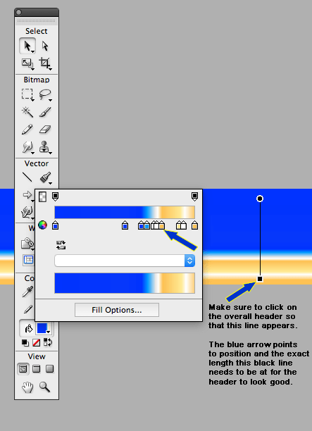
Note: Please don’t forget the most important fact with this beach header design — the gradient must also be consistent from a vertical viewpoint as well as horizontal. (See Figure 11.3)
(Figure 11.3. A screenshot of the thenth and final bucket with a blue arrow and comments about the vertical gradient measurement for the header.)
One Very Important Note: When finalizing this header in Fireworks, ALWAYS make sure to click on the header and see if the black square with the line attached to the small black circle is just perfect AND exact to the legths I have shown in Figure 11.3. If your header design is NOT comparable as far as the black line that my BLUE ARROW is pointing at in the screenshot, then the white lines and length of the blue sky AND the light blue wave created AND the mixed colored beach sand will not look right.
Once it looks comparable to what I have done for my header design, feel free to import your own images into this header for a more complicated beach scene or design some snappy beach extras using the tools already in Adobe Fireworks!
Whew! Finally! Surf’s up and Cheers!
Disclaimer: Adobe Fireworks, Adobe Photoshop, and Adobe Creative Suite are Trademarks of Adobe, Inc. Adobe is in no way affiliated with this site, ElementsofColdfusion.net.
Hey, You Can Follow Me On Instagram!


